
Wearable glucose monitoring
Global Wearables, a Dutch-Chinese manufacturer, partnered with a British biomedical company to bring the world’s first non-invasive Continuous Glucose Monitoring device to market. The brief was deceptively simple: make a medical device people actually want to wear every day.
Global Wearables
Industry
Medical
My role
Industrial and UX designer
Nobody wants to wear their diagnosis
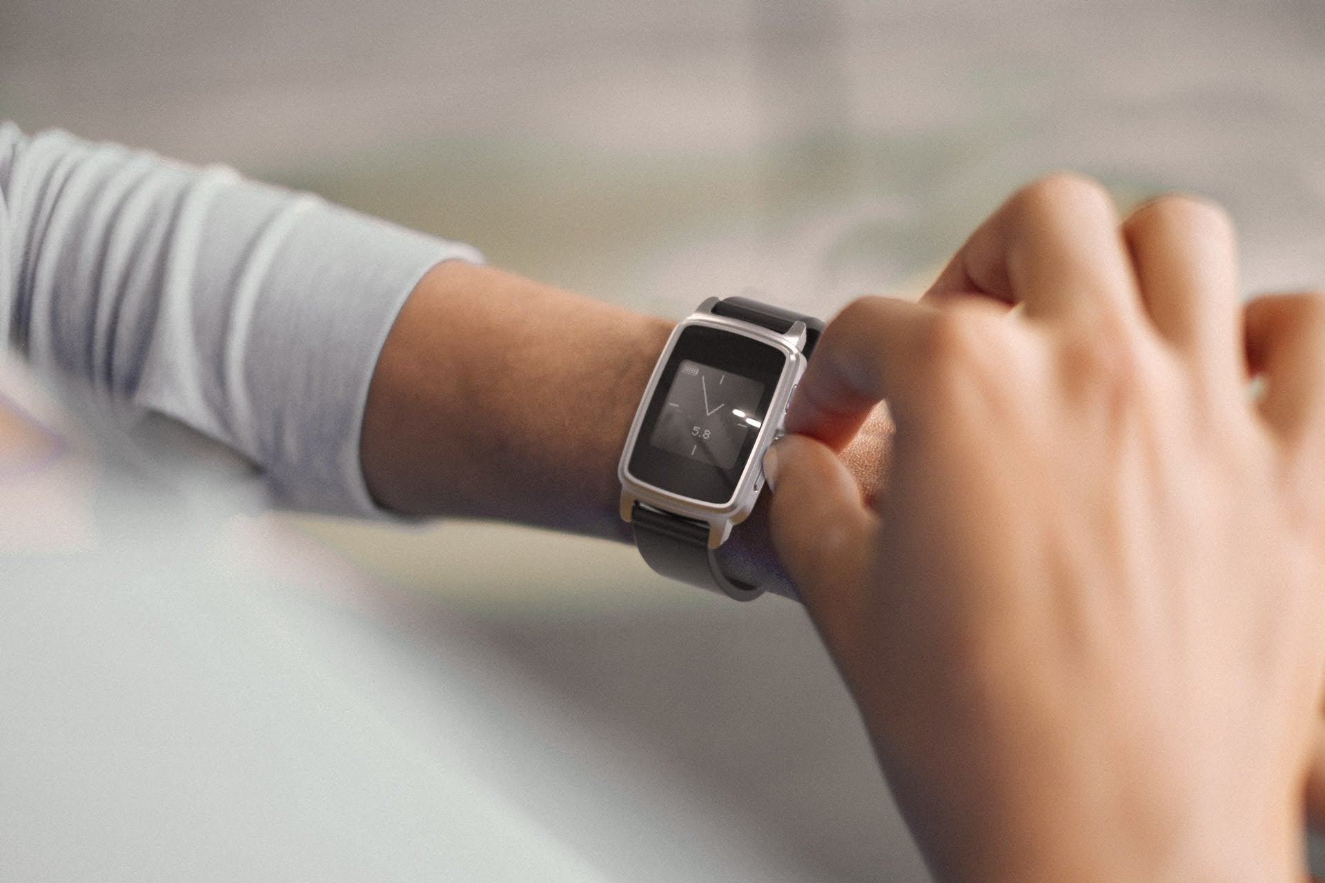
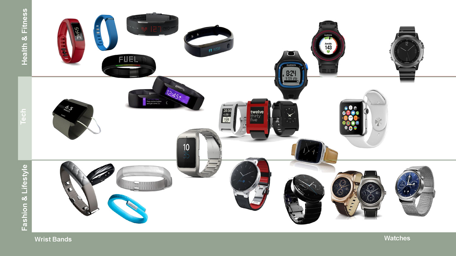
Most people managing diabetes don’t want a reminder strapped to their wrist. Early research made this clear; existing CGM devices carried a clinical look that signalled illness, and users consistently reported removing or hiding them in social situations. The opportunity wasn’t just technical. It was about designing something that felt like a choice, not a condition.
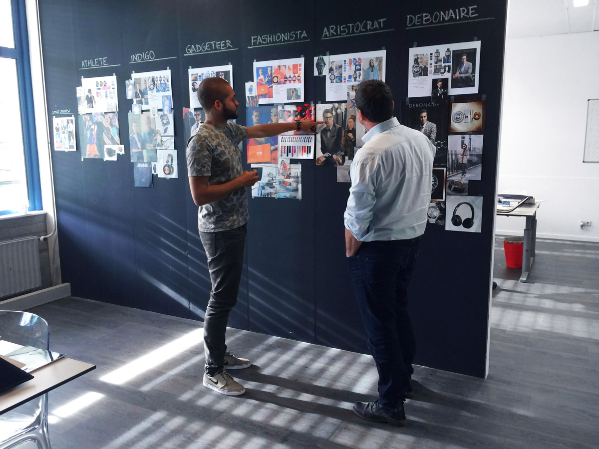
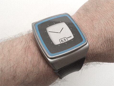
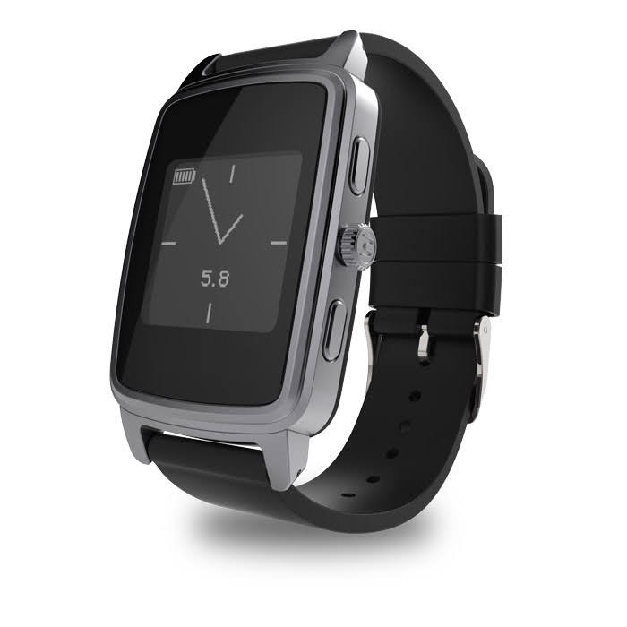
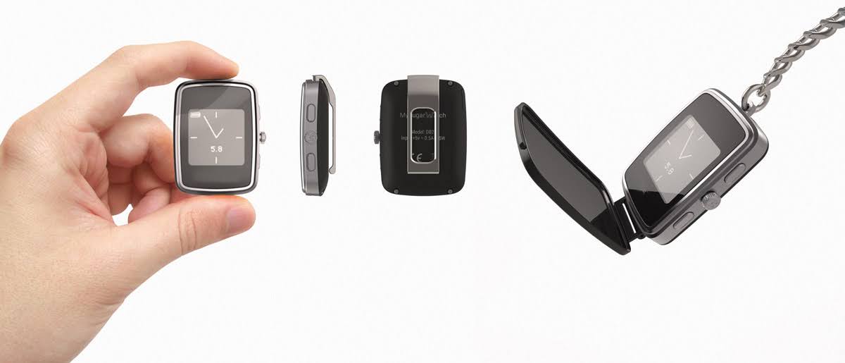
Two principles shaped everything that followed: the device had to look like something you’d buy in a consumer electronics store, and it had to flex around individual lifestyles rather than impose a single form.
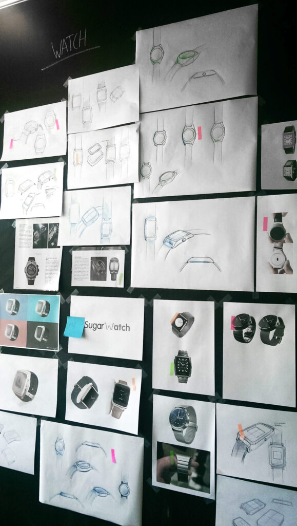
Designing around a moving target
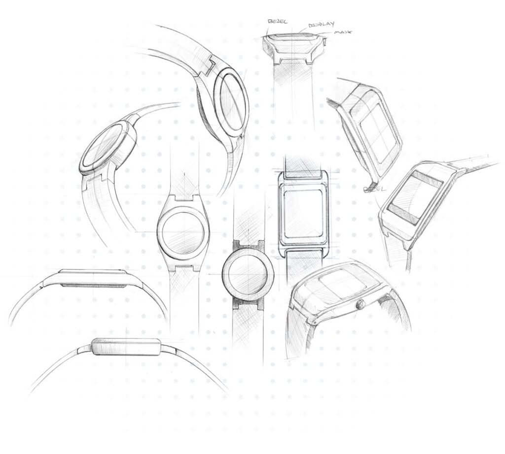
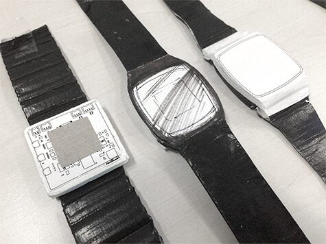
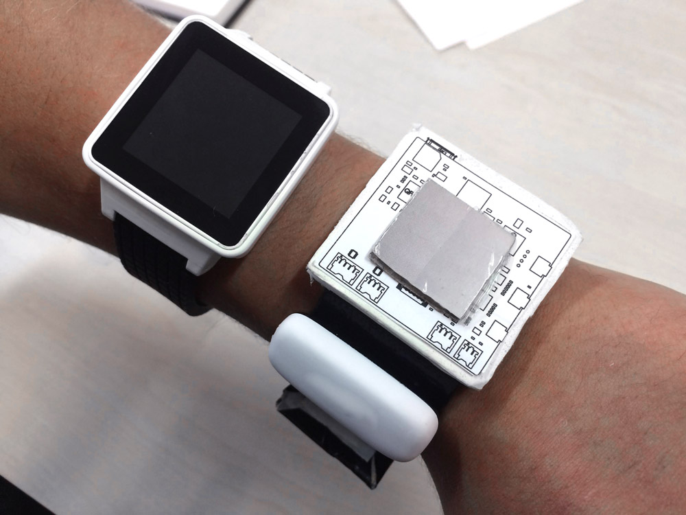
As the client’s PCB architecture evolved, the physical form had to evolve with it, which meant running design and engineering in parallel rather than sequence.
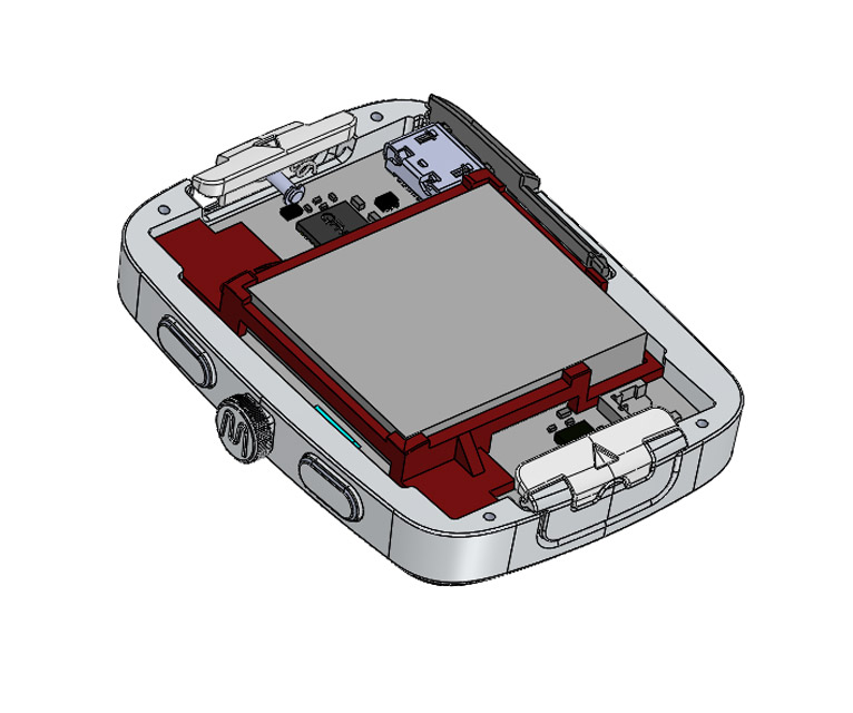
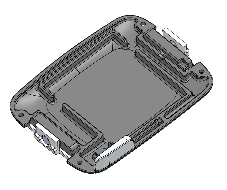
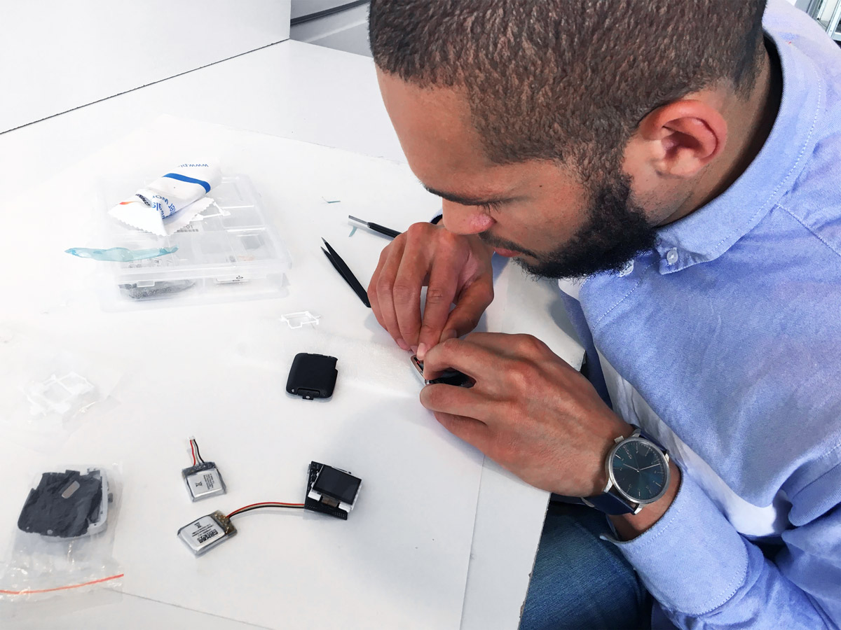
We adopted a rapid prototyping rhythm, testing form factors, ergonomics, and assembly methods in short cycles. As each iteration surfaced new constraints; a battery slightly larger than spec, a USB connector placement that shifted – our design absorbed them without starting over. The result was a modular architecture: interchangeable straps, bezels, and removable casing elements that let users personalize the device across contexts, clinical or otherwise.
Clarity on 128 × 128 Pixels
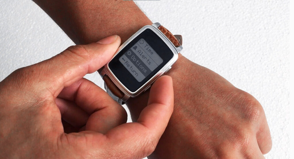
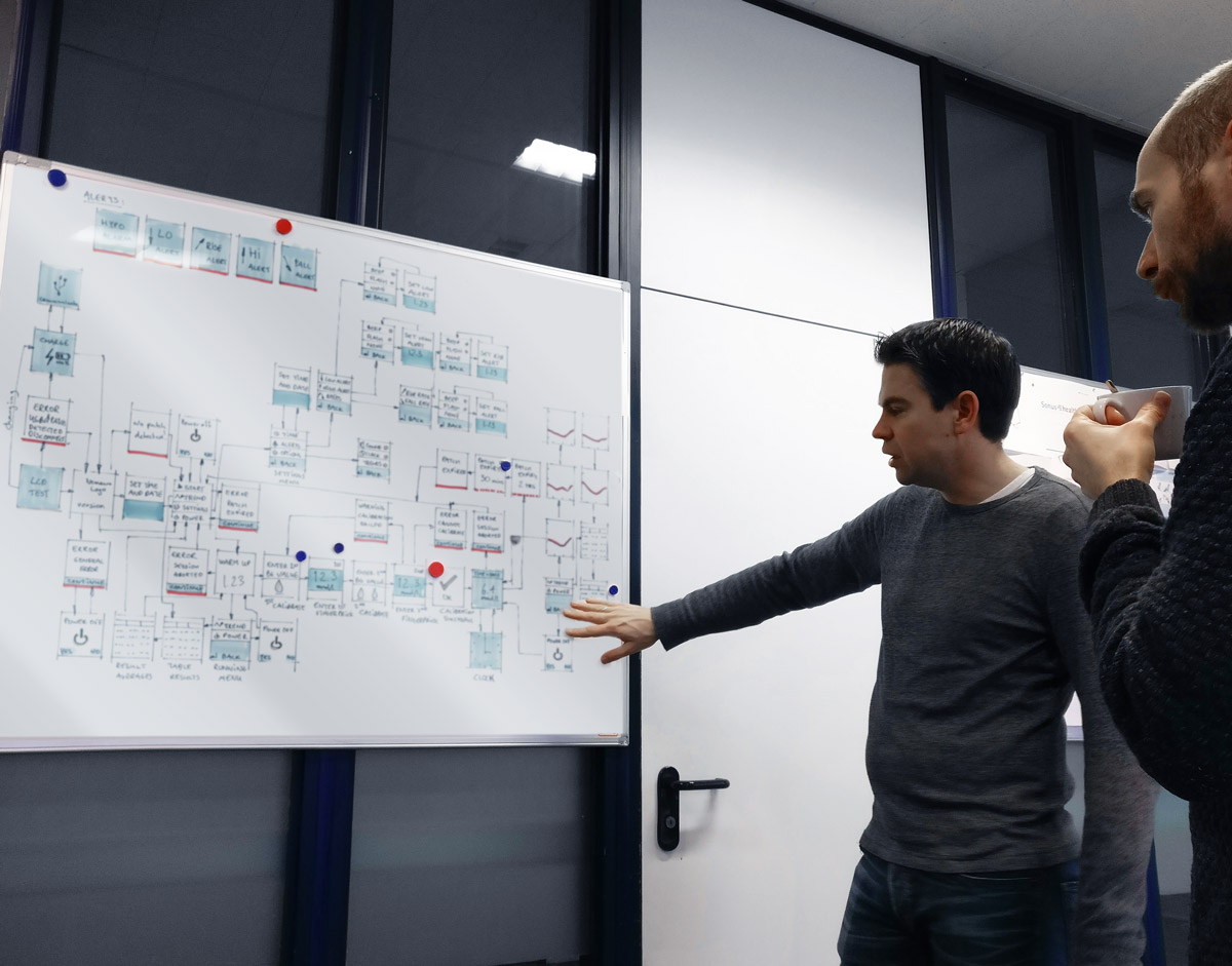
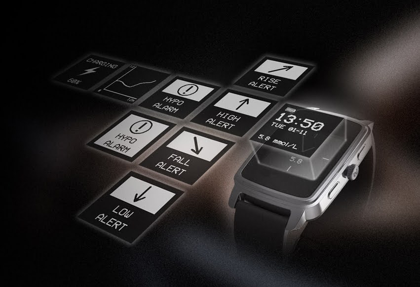
The display was a 128×128 pixel monochrome memory LCD, small, low-power, and unforgiving. Every element of the interface had to earn its place.
We focused on three things: making glucose readings immediately readable at a glance, keeping navigation shallow enough that users under stress could find what they needed without thinking, and designing for a wide range of tech confidence. Medical alerts needed to be urgent without being alarming. Secondary data, trends, history, battery had to be accessible without cluttering the primary view. The interface was developed in parallel with the physical design so that interaction patterns and hardware affordances stayed consistent across the full experience.
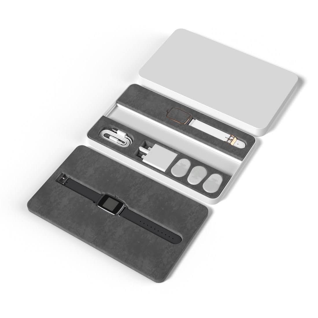
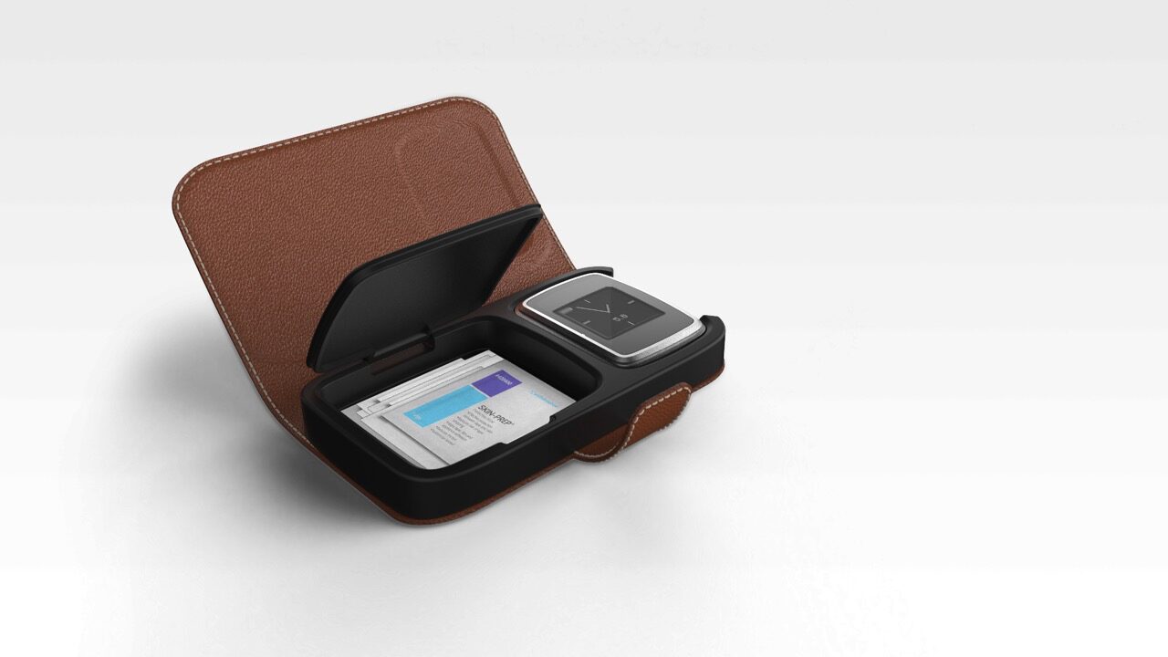
A Medical device that doesn’t look like one
The project delivered a clinical trial–ready test series that met both functional and regulatory requirements, but the more significant outcome was demonstrating that medical-grade technology and consumer-grade desirability don’t have to be in conflict.
The device that emerged was one people chose to wear, not one they tolerated. That distinction, it turns out, matters enormously for a product that only works if it’s on your wrist.